What's a Color Made of?
As highly visual creatures, we understand the world largely in terms of what we see. The colors in a scene, their presence and interactions, have the power to delight, disgust, and inform.
As citizens of a scientific age, we may wonder about the nature of color. What could a red apple possibly have in common with a red fire? Is color an objective physical property of these objects, or a subjective experience we made up? If it’s objective, what sort of physical laws are involved? If it’s subjective, how did we make it up? Is there a way to characterize all possible colors?
Part I: Primary Colors
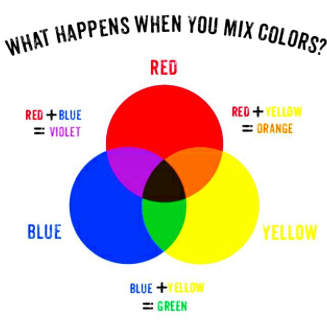
You may try to answer these questions by summoning memories of lessons from elementary school. Perhaps you had a painting session, in which you saw that a wide range of colors can be obtained from combinations of three primary paints: red, blue, and yellow. For example, blue and yellow paints can be mixed to obtain green, a secondary color. Adding red to the green mixture yields black. To summarize in a diagram:
Maybe a few years pass, and you find yourself in an IT class. You learn that TVs and other electronic displays produce realistic images by emitting combinations of three primary lights: red, blue and… green! This theory seems to agree with your biology class, where the retina is said to contain three types of cone cells, each sensitive to red, blue or green light. Apparently, light comes in three varieties, and our brains process combinations of them as follows:

But hold on, how did red and green go from making black to making yellow? This diagram seems to completely defy our common sense experience with paint and crayons!
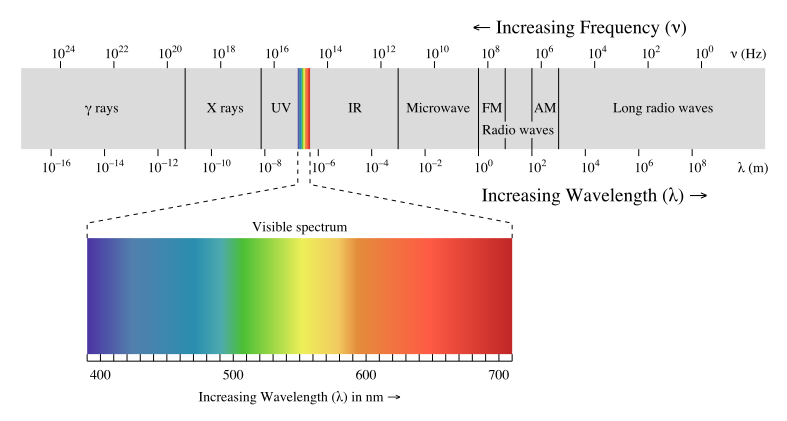
Before we can finish our thoughts, a physics teacher enters the room. As if to delight in our confusion, as physics teachers often do, she explains that our eyes are in fact sensitive to electromagnetic (EM) radiation whose wavelength and frequency are within a thin continuous band. We have names for each of the bands: the longest EM waves are radio waves, whereas short ones are gamma and X-rays, but they are all fundamentally the same physical phenomenon. The human eye is only sensitive to a thin band of EM waves, which we call visible light:
In this theory, no mixing is needed because light comes in infinite varieties, providing the entire spectrum of color that you see in a rainbow! Indeed, rainbows occur when mixed (white) light is refracted in a wavelength-dependent manner. Now if you happen to be especially attentive, you might notice that magenta is missing from the rainbow… hmm!
It looks like our teachers have made a fun sport out of contradicting each other at the expense of impressionable minds! Can we reconcile their theories?
What might surprise you is that the plain act of uncovering these apparent contradictions is a major breakthrough in our journey! By digging to the source of disagreements, we’ve arrived very close to the truth. Taking this little-known technique to heart will turbocharge your learning.
In this case, having learned an objective (physical) theory that includes an infinite continuum of varieties of light, it’s a good time to revise our subjective (perceptual) theory of color. Let’s revisit those cone cells…
Part II: Cone Cells
Alright, so the physics part of our investigation was pretty easy. You may be tempted (or scared!) to read more about how EM works, but there’s really no need. The last diagram gave us the right idea: light is just EM radiation whose wavelength happens to fall within some range. The complications come not from the physics of EM, but from the biology.
Before turning to our favorite search engines for a full answer, let’s imagine how color perception might work, hypothetically. This exercise will deepen our understanding of the underlying logic behind the mess in which we find ourselves.
We know that we’re capable of seeing an infinite variety of light (up to a reasonable precision) because we see it in the rainbow: this is the continuum of wavelengths known as the visible spectrum. We perceive this spectrum as varying continuously from deep red, slightly orangish red, orange-red, reddish orange, orange, golden orange, golden yellow, and so on through all the colors of the rainbow, down to indigo and violet. These are the spectral colors, produced by monochromatic light, meaning light composed purely of a single wavelength.
By mixing the spectral colors, it’s possible to get non-spectral colors that don’t appear on the rainbow, such as white and magenta. With an infinite variety of pure spectral colors available, the possible combinations we can make with them boggle the mind! However, our eyes cannot distinguish between all possible combinations. For example, recall that our displays mix red and green lights to appear yellow: this is a mixture whose appearance closely resembles that of the rainbow’s pure spectral yellow.
Our limitation stems from the fact that our eyes typically only have three types of light-sensitive cone cells. Our visual cortex never learns the full spectral power distribution, which is a fancy term for the full “recipe” we’d write down if we were to describe how much of each wavelength is included in an EM mixture. Instead, the visual cortex effectively works with three numbers per location in its visual field, corresponding to the amount of activation on each cone type.
How do three types of cones accomodate a continuous spectrum? Since we’re able to perceive the entire visible EM band, it must be the case that the three types together cover the band. Indeed, here’s a graph plotting the sensitivities of each cone type against each wavelength:
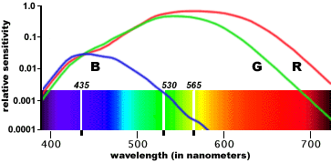
There are three curves, corresponding to three types of cone cells. The horizontal axis corresponds to wavelength, and the height of a curve at each position tells us how sensitive the cone is to that wavelength. We see here that one type of cone (let’s call it R) peaks in the red-to-yellow range, one (G) in the green and one (B) in the blue-to-indigo. When multiple wavelengths shine on the same cone cell, its activation is the sum of its sensitivities to the individual wavelengths: this is an empirical result known as Grassman’s law.
Now, we see that monochromatic yellow light activates both R and G cones, with almost no activation of B. This is very similar to the activations induced by a mixture of red and green light; as a result, these two cases yield very similar subjective appearances. Different spectral power distributions that appear the same, because they induce the same RGB activations, are called metamers.
Some RGB activations cannot be induced by monochromatic light. For example, we can see from the graph that it takes at least two distinct wavelengths to simultaneously activate both R and B without G; the brain’s response to this combination is what we call magenta, and explains why we don’t see it in the rainbow. White is another example: no single wavelength activates all three cone types equally.
Finally, we find certain RGB activations that cannot be induced by any sort of light, mixtures included. For example, it’s impossible to get a pure G activation without also getting a bit of R or B mixed in there. If you could magically activate only your G cones, you would see a color that doesn’t exist in the real world: a subjective experience with no physical counterpart! This is a forbidden color.
Without going into every possible detail of physics and biology, we now have a coherent understanding of color, connecting the physical phenomenon with how it’s perceived. Summarized in one sentence, color is derived from the cone cell activations induced by mixtures of EM waves. Armed with these insights, can we draw a new diagram that characterizes all possible colors, including the non-spectral ones, in a natural way?
Part III: Color Space
We already came close to our goal when we saw the rainbow embedded within the EM spectrum. The spectral colors can be arranged along one axis, because they are specified by a single parameter: the wavelength. If we wanted to, we could add a second axis for brightness: shining a more intense light at the same wavelength makes it brighter.
To describe an arbitrary EM mixture, you’ll need infinitely many axes: one to specify how much of each wavelength is used. However, our subjective experience is determined only by the level of R, G and B activation. If we let the three spatial coordinate axes correspond to these activations, we get the Cube of All Colors:
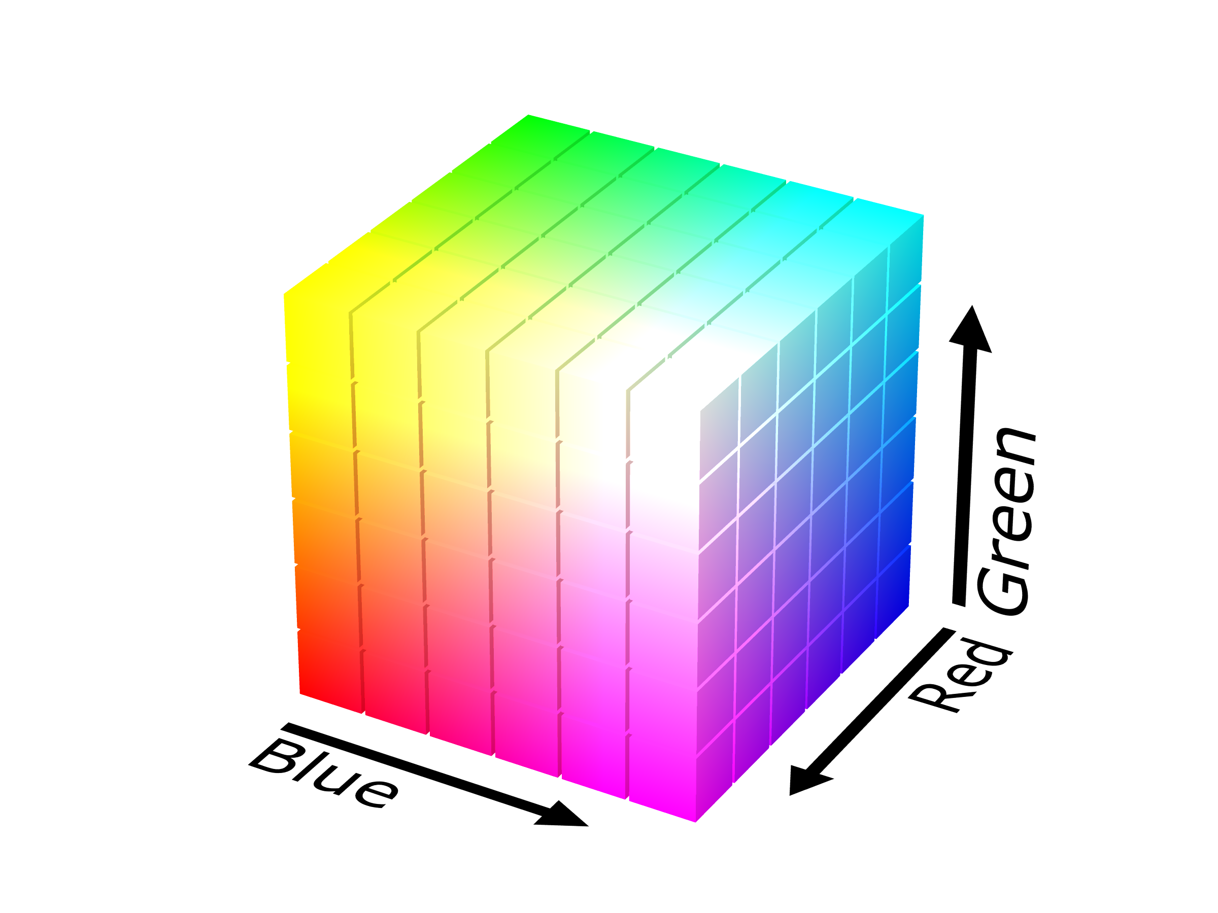
Or do we? Alas, this cube is a fake! It contains those forbidden colors we mentioned; in particular, its corners correspond to pure activations, so we should at least carve out some of the perimeter. If we don’t care about brightness, we can remove even more. In this image of a cube, every point that’s hidden from view (e.g., the back and interior) is just a dimmer version of a color on the surface.
In summary, after removing the forbidden envelope of the cube, we can take a slice of the remaining solid to represent all of its colors at a fixed level of brightness. The result is a two-dimensional color space, allowing us to present all possible colors1 on a flat display or sheet of paper.
Okay, while it’s nice that we can theoretically present everything in 2D, this is starting to sound complicated. Let’s cheat for a moment and look up the answer. We can resume trying to understand it afterward. A quick web search reveals the CIE 1931 color space:

Remember that all we’ve done is project the color cube onto a flat plane. Why the triangular and horseshoe shapes? Let’s explore whether they make sense.
Given any spectral distribution, our handy cone sensitivity graph lets us calculate the corresponding cone activations, which become coordinates in the color cube. The CIE standard then projects these to coordinates in the plane corresponding to a slice from the cube.
Which positions in the CIE space do the spectral colors occupy? Try to convince yourself that they must form an unbroken continuous curve. For a hint, look up the formal mathematical definition of a continuous function. I won’t give a formal proof, but here’s an intuitive sketch:
Let’s start from the longest visible wavelength (red) and find its place in CIE space. Then, let’s gradually lower the wavelength towards the violet end. Our cone sensitivity graph shows a smooth dependence on wavelength. Therefore, a sufficiently tiny change in wavelength causes a tiny change in cone activations, which remains a tiny change after projecting to CIE. As we visit all the wavelengths from red to violet, moving a little bit at a time, we’ll trace out a continuous curve in CIE space.
What about the non-spectral colors? By Grassman’s law, the mixture of two colors always lies on the line segment between them. Now imagine repeating this process, mixing additional colors one at a time. Given any set of colors to start with, we would find that their possible combinations take up the whole interior region bounded by the starting colors; in formal terms, their convex hull. A hands-on way to see the convex hull is to place thumbtacks all over the starting set. If we surround them all tightly with a thin rubber band, the region it would contain is the convex hull.
The CIE “horseshoe” is simply the convex hull of our spectral curve: it connects the red and violet ends with a straight line segment, and fills in the interior. The straight segment closes our curve with purples and magentas, and explains why artists talk about a color wheel instead of a two-ended spectrum. Meanwhile, the interior contains colors of lower saturation. Altogether, the horseshoe contains every color that your eyes can see. The forbidden colors, which cannot be produced by any light, lie outside the horseshoe. Beautiful!
Finally, in case you were wondering, the black interior curve corresponds to the spectrum emitted by a blackbody, an idealized object that absorbs all incoming light. At room temperature, such an object would appear black; approaching 1,000 degrees, it glows red-hot; past 10,000 degrees, it radiates blue-white. Ironically, the hottest stars in the night sky glow in “cool” colors that we typically associate with icy climates. The point labeled D65 corresponds to the surface of the Sun. It should come as no surprise that our visual sensitivity has evolved to peak at about the same wavelength as sunlight!
Part IV: Color Technology
Scientists propose and test theories to explain how natural things work. Engineers apply theories to design new, useful things. In a way, these activities are inverses of each other. Together, they enable technology: the art of manipulating nature to one’s will.
Having learned the scientific basis for color perception, let’s put on our engineer hats and see what we can create! Video is a technology that convincingly (to human eyes) reproduces the visual stimulus of a detailed scene. This requires the ability to produce a spectacular variety of colors at a moment’s notice. While it would be an impressive feat to faithfully replicate the spectral power distribution from a real scene, our goal in practice is less ambitious: to fool the human eye. To produce convincing scenery, we need only produce the right RGB activations.
TVs and computer screens can be built from tiny subpixels that each emit a dot of one specific color. We can turn each light off, or have it on at any brightness. Since the CIE space projects away the brightness dimension, each type of subpixels is anchored to one point in the space.
White pixels alone suffice to give us black-and-white television: just dim the pixels to produce darker shades of grey. Now suppose we had two types of subpixels: red and green. Adjusting their brightness in different proportions yields a range of hues such as orange and yellow. In color space, we’re capable of representing not just one point, but the entire line segment connecting the two source colors.
In general, the range of colors we can represent will be the convex hull of the source colors. For example, the sRGB standard uses red, green and blue subpixels to produce colors in a triangular region, as shown inside the horseshoe above. If your monitor is sRGB, it’s incapable of displaying colors outside the triangle. The region outside the triangle but inside the horseshoe corresponds to colors that you might find in the wild, but that your screen cannot display. Due to this limitation, the color space image on this webpage is actually drawn in the closest colors that your screen can display.
It’s often said that red, green and blue are the additive primary colors. Additive refers to the act of mixing colors by emitting, hence adding, different source lights. Colors made from one source light are primary; colors made from an equal mix of exactly two source lights are secondary. Red, green and blue occupy distant corners of the color space, suggesting their suitability as primary colors.
To display richer colors than sRGB is to grow its region in color space. This can be done in two ways. The first is to make our subpixels purer, i.e., place them closer to the horseshoe boundary, corresponding to monochromatic light. This is the approach taken by UHDTVs. The alternative is to add more primary colors.
Using these two approaches, we might hope to capture all the colors. However, since the convex hull of any finite set is a polygon, it cannot possibly fill the rounded edges of the horseshoe. We conclude that this type of technology must necessarily miss some colors.
If we cheat a bit, we can view the forbidden colors corresponding to pure R, G and B cone activation as the ultimate primary colors. Together, they form a big triangle that fully contains the horseshoe; we know this because every color corresponds to some RGB cone activations. Unfortunately, these “primary colors” are not real colors realizable by any physical process!
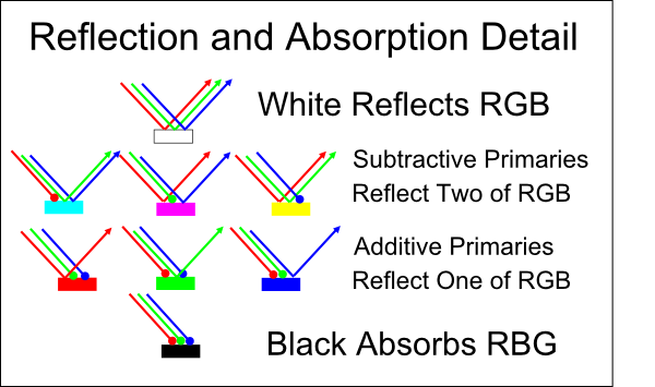
In retrospect, we can view our IT class’s RGB Venn diagram as a simplification of additive color mixing. What about the RYB diagram from painting class? That’s subtractive color mixing. Unlike TVs, paint and printer inks don’t produce any light of their own. Instead, you shine an ambient light, such as from a bulb or the Sun, on a sheet of paper. The paper is a good reflector at all visible wavelengths, so it appears white. The ink absorbs, hence subtracts, selected wavelengths, preventing their reflection.
At this point, maybe we’re feeling tired and don’t want to dig deeply into the physics of subtractive mixing. That’s ok! We can reason through the simplified, though technically incorrect, model that discretizes light into three varieties: long-wave (red), medium-wave (green) and short-wave (blue). In this simplified model, it follows that the primary subtractive colors correspond to secondary additive colors, and secondary subtractive colors correspond to primary additive colors. This is best explained with pictures:
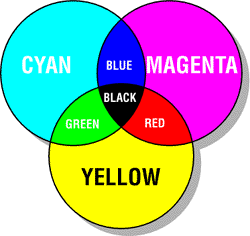
Indeed, most color inkjet printers have three primary inks: cyan, magenta, and yellow (CMYK). K stands for black, and is preferable to mixing CMY inks because it’s cheaper and typically yields a deeper, sharper black. Cyan and magenta are sometimes called “process blue” and “process red”, respectively. Thus, you can think of CMY as a modern improvement over the traditional RYB primaries.
Conclusion
Phew! We covered a lot, but all of our conclusions were logical consequences of the fact that we have three types of light-sensitive cells following Grassman’s law. We might try to memorize every detail of additive and subtractive color mixing, the horseshoes, the triangles and so on. We might see them as random, interesting, messy facts about the world.
Instead, we took a different approach. We explored how a variety of ideas from physics, biology, geometry, and painting could come together and tell a story. We thought critically, asking questions and testing potential answers, some of which stood in apparent contradiction to one another. Through a theoretical exercise, we discovered the hidden beauty of colors.
I hope you enjoyed this post! There’s a lot more to human color perception than presented here. If you want to learn more, a good place to start is the HyperPhysics Color Puzzles.
If you’d like to read someone else’s explanation of the same topic, check out:
Hey Kids! Red’s Not a Primary!
A Beginner’s Guide to Colorimetry
-
Note, however, that grey is effectively a darker white, and brown is a darker orange. Our perception makes relative comparisons that take context, light sources and shadows into account. Optical illusions take advantage of this. By necessity, this exposition contains simplifications. ↩